

Discover
Đọc hành vi và nhu cầu thực tế qua analytics, khảo sát và ý kiến stakeholder.
Đầu ra: Insight & chân dung khách hàng.
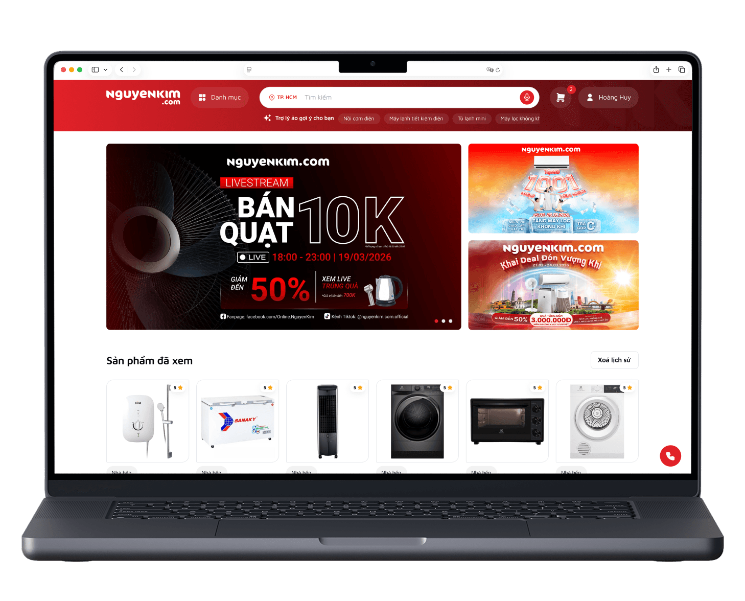
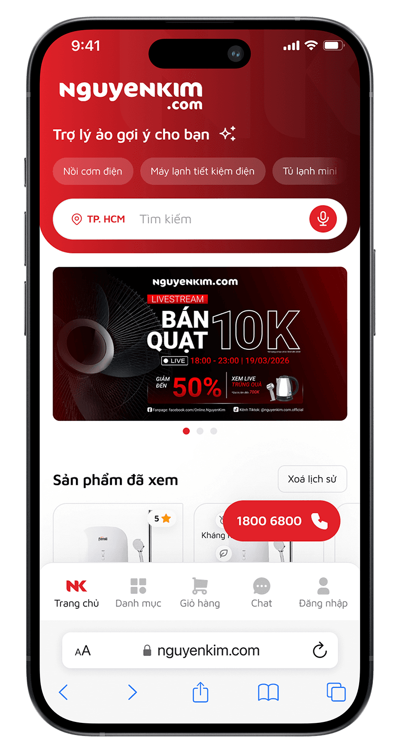
Williens triển khai các nghiên cứu và khảo sát nhằm tái cấu trúc trải nghiệm e-commerce, kết nối nghiên cứu người dùng, kiến trúc thông tin, mobile-first design, design system và quy trình bàn giao sẵn sàng triển khai.
RESEARCH / HIỂU ĐIỂM NGHẼN
CÁCH WILLIENS VẬN HÀNH
Chúng tôi áp dụng Agile UX để liên tục kiểm tra và hoàn thiện giải pháp qua research, user flow, UI, review và handoff. Phạm vi dự án không cung cấp căn cứ để mô tả quy trình này là Scrum thuần với backlog và sprint cố định.
Đọc hành vi và nhu cầu thực tế qua analytics, khảo sát và ý kiến stakeholder.
Đầu ra: Insight & chân dung khách hàng.
Biến tín hiệu nghiên cứu thành thứ tự ưu tiên rõ ràng: journey, sitemap, task flow.
Đầu ra: Ưu tiên UX & kiến trúc thông tin.
Phát triển UI mobile-first có thể mở rộng: wireframe, responsive UI, component.
Đầu ra: Mobile-first UI & responsive system.
Ghi lại rationale và chuẩn bị triển khai: guideline, prototype, checklist.
Đầu ra: Tài liệu sẵn sàng cho triển khai.
RESEARCH OPERATIONS
Công nghệ giúp đội ngũ xử lý khối lượng thông tin nhanh hơn, còn kết luận UX vẫn được đối chiếu với dữ liệu, bối cảnh vận hành và review của chuyên gia.
VSPSS và Python hỗ trợ làm sạch dữ liệu, kiểm tra phân khúc và đọc các mẫu phản hồi có hệ thống.


Tiếp tục cuộn đến xem thêm
Một commerce core, bốn cách trình bày đúng với cách khách ra quyết định.
Thay vì nhân bản PDP theo từng ngành hàng, Williens thiết kế một core commerce thống nhất với search, trust, price, stock, CTA và service, có thể bật/tắt block theo bản chất sản phẩm.
Với điện thoại, TV và laptop cao cấp, hình ảnh và trải nghiệm sản phẩm cần dẫn dắt quyết định.
 Media lớnFeature storySo sánh phiên bản



Với điện thoại, TV và laptop cao cấp, hình ảnh và trải nghiệm sản phẩm cần dẫn dắt quyết định.
Spec hierarchyBộ lọcTechnical compare

Thiết bị điện máy lớn cần bối cảnh triển khai thực tế: kích thước, lắp đặt và giao nhận.
Kích thướcLắp đặtFulfillment địa phương

Thiết bị điện máy lớn cần bối cảnh triển khai thực tế: kích thước, lắp đặt và giao nhận.
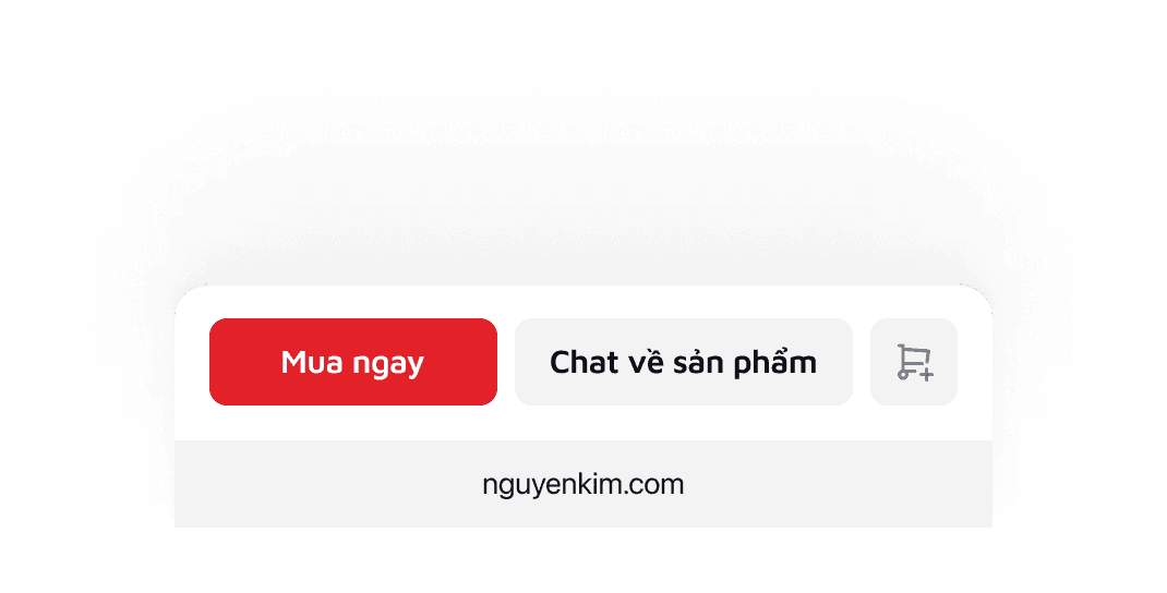
Thông tin cốt lõiGiá rõCTA nhanh

Commerce lifecycle
Research chỉ ra nơi trải nghiệm cần rõ hơn: tìm kiếm, giá và ưu đãi, giao nhận, chăm sóc sau mua.
Search, category, PLP và PDP được tiếp nối thành một trải nghiệm thông tin nhất quán.
 light…r/greyscale/neutral/200default…r/greyscale/neutral/500heavy…r/greyscale/neutral/950inverted…or/greyscale/neutral/50white…r/greyscale/elevation/0black…eyscale/elevation/1000blend…cale/neutral/500-blend▦ 40%disabled…e/neutral/500-disabled▦ 40%light…lor/semantic/green/100default…lor/semantic/green/500heavy…lor/semantic/green/950invertedcolor/semantic/green/50blend…entic/green/500-blend▦ 40%light…or/semantic/yellow/100default…or/semantic/yellow/500heavy…or/semantic/yellow/950invertedcolor/semantic/yellow/50blend…entic/yellow/500-blend▦ 40%lightcolor/semantic/red/100defaultcolor/semantic/red/500heavycolor/semantic/red/950invertedcolor/semantic/red/50blend…ementic/red/500-blend▦ 40%lightcolor/semantic/blue/100defaultcolor/semantic/blue/500heavycolor/semantic/blue/950invertedcolor/semantic/blue/50blend…mentic/blue/500-blend▦ 40%lightcolor/brand/primary/200defaultcolor/brand/primary/600heavycolor/brand/primary/900inverted…r/greyscale/elevation/0blend…and/primary/600-blend▦ 40%gradient-leadingcolor/brand/primary/600gradient-trailingcolor/brand/primary/950light…r/brand/secondary/100default…r/brand/secondary/800heavy…r/brand/secondary/950inverted…r/greyscale/elevation/0blend…/secondary/800-blend▦ 40%light…r/greyscale/neutral/200default…r/greyscale/neutral/500heavy…r/greyscale/neutral/950inverted…or/greyscale/neutral/50white…r/greyscale/elevation/0black…eyscale/elevation/1000blend…cale/neutral/500-blend▦ 40%disabled…e/neutral/500-disabled▦ 40%light…lor/semantic/green/100default…lor/semantic/green/500heavy…lor/semantic/green/950inverted…lor/semantic/green/50blend…green/500-blend▦ 40%light…/semantic/yellow/100default…/semantic/yellow/500heavy…/semantic/yellow/900inverted…/semantic/yellow/50blend…yellow/500-blend▦ 40%light…/semantic/red/100default…/semantic/red/500heavy…/semantic/red/900inverted…/semantic/red/50blend…red/500-blend▦ 40%light…/semantic/blue/100default…/semantic/blue/500heavy…/semantic/blue/950inverted…/semantic/blue/50blend…blue/500-blend▦ 40%light…/brand/primary/200default…/brand/primary/600heavy…/brand/primary/900inverted…/greyscale/elevation/0blend…primary/600-blend▦ 40%light…/greyscale/neutral/400default…/greyscale/neutral/700heavy…/greyscale/neutral/900inverted…/greyscale/neutral/50white…/greyscale/elevation/0black…/greyscale/elevation/1000light…/semantic/green/300default…/semantic/green/700heavy…/semantic/green/900inverted…/semantic/green/50blend…green/700-blend▦ 40%light…/semantic/yellow/300default…/semantic/yellow/800heavy…/semantic/yellow/900inverted…/semantic/yellow/50blend…yellow/800-blend▦ 40%light…/semantic/red/300default…/semantic/red/700heavy…/semantic/red/900inverted…/semantic/red/50blend…red/700-blend▦ 40%light…/semantic/blue/300default…/semantic/blue/700heavy…/semantic/blue/900inverted…/semantic/blue/50blend…blue/700-blend▦ 40%light…/brand/primary/300default…/brand/primary/700heavy…/brand/primary/900inverted…/greyscale/elevation/0blend…primary/700-blend▦ 40%light…/greyscale/neutral/400default…/greyscale/neutral/700heavy…/greyscale/neutral/900inverted…/greyscale/neutral/50white…/greyscale/elevation/0black…/greyscale/elevation/1000blend…neutral/700-blend▦ 40%disabled…neutral/400-disabled▦ 40%light…/semantic/green/100default…/semantic/green/500heavy…/semantic/green/950inverted…/semantic/green/50blend…green/500-blend▦ 40%
Typeface
Kiểu font sans-serif hiện đại, độ đọc cao và vẫn chắc chắn ở kích thước lớn. Heading đậm, cỡ lớn để thu hút; nội dung phụ dùng cỡ nhỏ hơn để đảm bảo rõ ràng và có cấu trúc. Cân bằng độ đậm và khoảng cách chữ tạo cảm giác chuyên nghiệp, hiện đại, đúng tinh thần thương hiệu.
Design system
Hệ thống design system được thiết kế tối ưu với 134 color token và 30 typography token làm nền cho toàn bộ giao diện, nhất quán từ trang chủ đến checkout.


